Configurator design tips
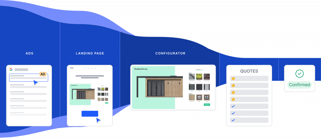
Designing a product configurator that converts customers

It’s one thing to add all your product data and visuals into configurator software – but that’s just the first step.
Here’s what we’ve learned over the past five years, having designed and built hundreds of custom configurators and making many mistakes and tweaks along the way.
Your configurator needs to:
If you follow these guidelines, you can make sure that your configurator looks professional and converts well. Read our top tips for configurator design and optimization, and shape your configurator into a sales-boosting growth engine.
Perfecting your configurator design
When it comes to the visual design of product configurators, there are three main areas to pay special attention to. Your goal with configurator design is to make your configurator look polished, no matter what your visitors use to display and play around with it.
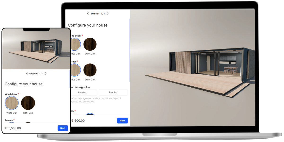
01 Use high-quality images
We’re told not to judge a book by its cover, but in reality, we all do it. Yes, including your customers. Your product images are to your product what the cover is to a book. If the book cover isn’t attractive and representative of the book’s contents, then it just won’t be picked up. If the cover art is boring, then readers might assume that the contents are boring as well.
The same thing goes for product images. Keep in mind that sharp, well-centered and visually pleasing images aren’t there just to make your product look good. They give potential customers clues into how your company operates, what level of service they can expect, and so on.
Make sure you’re using high-quality images with a large enough resolution so that they display correctly on all screens. The rule of thumb for online images is to use double the pixels to preserve sharpness on high-res and Retina display. Here are some examples for standard sizes in SaleSqueze:
- 400 px width for cards
- 1200×1200 px for main display
- 1920 px width for full screen display
Whether you’re using a 2D render, panorama, or 360° visualization of your product, make sure your images are hi-res. We recommend using the WEBP image format for best results.
02 Add a mobile version
Did you know that mobile traffic accounts for about two-thirds of all web traffic? According to SimilarWeb data, the global market share of mobile traffic in June 2024 was 68.49%, and in some markets, it was even higher, up to 75-80%.
This means that your website needs to support mobile users with a smooth user experience. If not, you could be losing a big share of your visitors. Rather than learning about your product and submitting an inquiry, these visitors will simply leave your website and buy from your competition instead.
With growing costs of online traffic, you should make sure to turn as many visitors into leads as you can. A product configurator that works on mobile devices is essential for this. The good news is that you can enable and customize a mobile version of your configurator in SaleSqueze very easily.
03 Be consistent
To ensure that your configurator feels professional and trustworthy, use a uniform look and feel throughout. Be consistent in how you use fonts, what sizes and styles you use for headings and descriptions, what colors you use and how you space them all out. The same goes for other element styling, like buttons and selectors.
In addition to the visual language, you should also use uniform verbal language and syntax. Be mindful of your punctuation and capitalization, and use consistent terms throughout the configuration process. There is a time and place for creative writing, but not here and now.
Use templates, themes, and global design settings to set up your default design rules, so you don’t have to adjust each element manually. You can even apply a Theme to an existing configurator and easily facelift its design.
Improve your performance
Now that your configurator looks polished, let’s focus on its user experience. With a well thought-out configuration logic and flow, more of your potential customers will stick around and proceed to the final step of your configurator. That means more inquiries, leading to more sales.
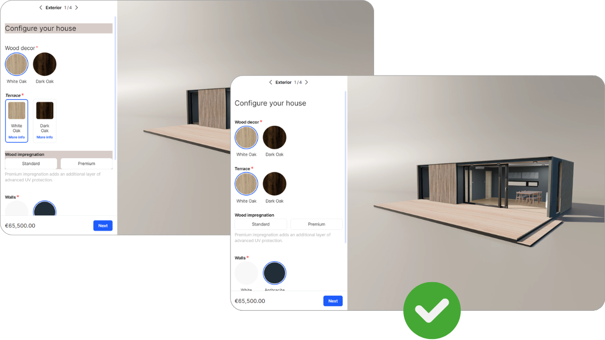
04 Organize features and steps in a logical way
Are your features organized into logical groupings, and are your steps arranged in a way that makes sense?
Consider grouping related features together, and keep the visualization in mind as you do it. For example, if you’re selling a modular house, listing exterior and interior elements in separate groups or steps can work very well.
Don’t forget – your potential customers will likely play around with your configurator, going back and forth between steps to try out different features and options. Organize your features well so that it’s easy for them to find what they’re looking for.
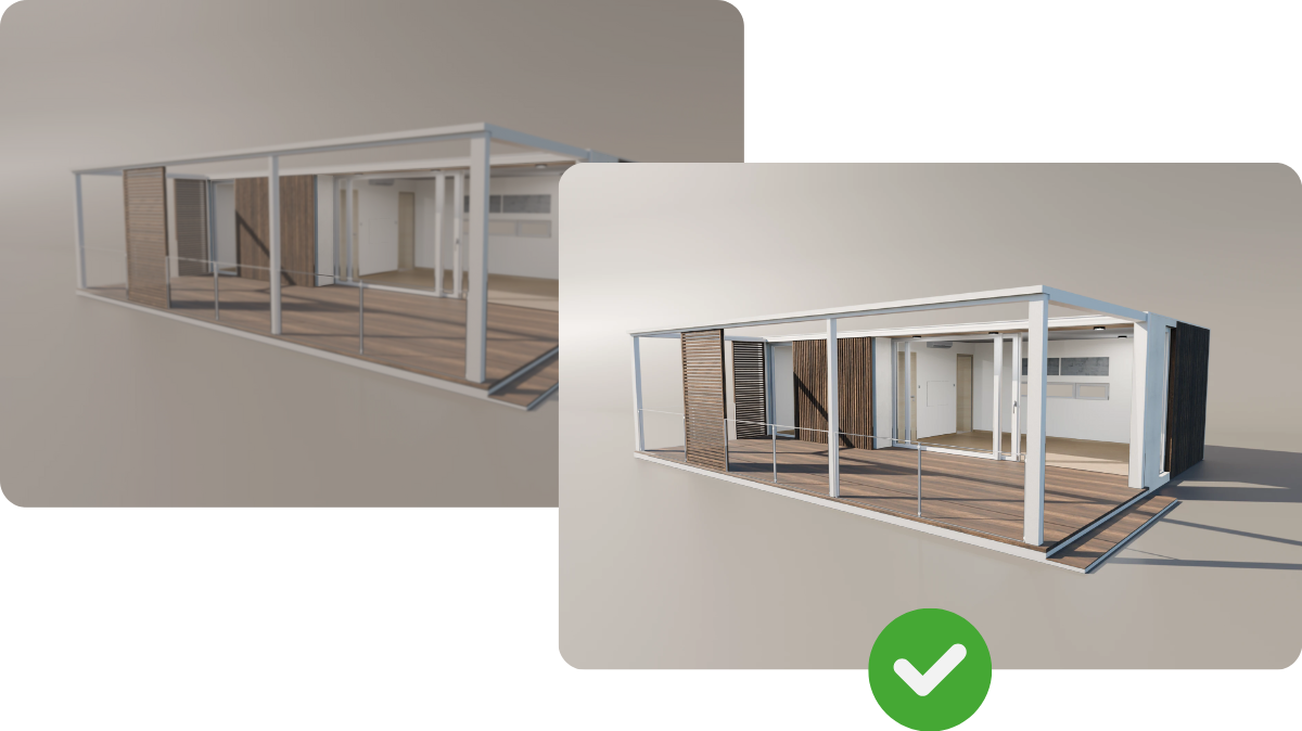
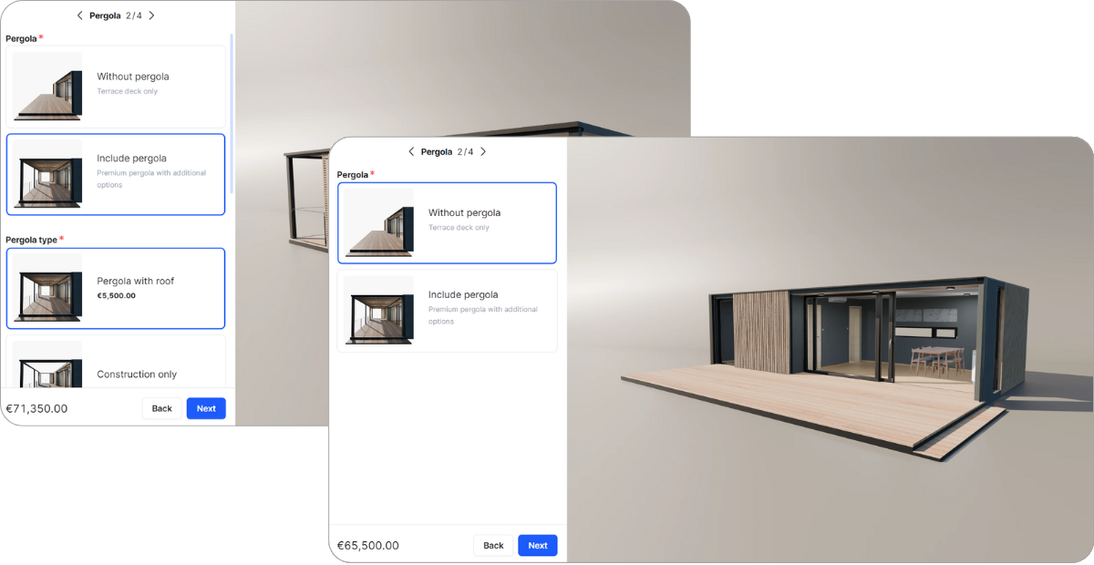
05 Include filters and rules
You don’t need to display every single feature and option to your customers at all times. Use filters and rules to clean up the user interface and hide irrelevant and disabled options.
You can find a great example of this in our demo modular house configurator. If the user selects a pergola add-on with just the structure and no roof, then the option to add lights is automatically hidden. Since the lights are intended to be installed on the pergola ceiling, it’s best to just hide the unavailable option to avoid causing any confusion for the customer.
06 Don’t use too many or too few steps
Is your configurator using too many steps, or could you add more? Depending on your product, the sweet spot is between 3 and 5 steps.
Let’s talk more about steps. Steps in SaleSqueze are analogous to slides in a slideshow, so they represent individual screens of features and options. The steps serve as a way to break up the configuration process into manageable chunks so that the users don’t get overwhelmed by all the options.
While the optimal number of steps can be different for each product, depending on the number of features, there is a rule of thumb you may want to keep in mind. In general, it’s best to keep to around 3 to 5 steps.
Of course, these are just observations from our existing customers – your product may require more or less steps, so use your discernment!
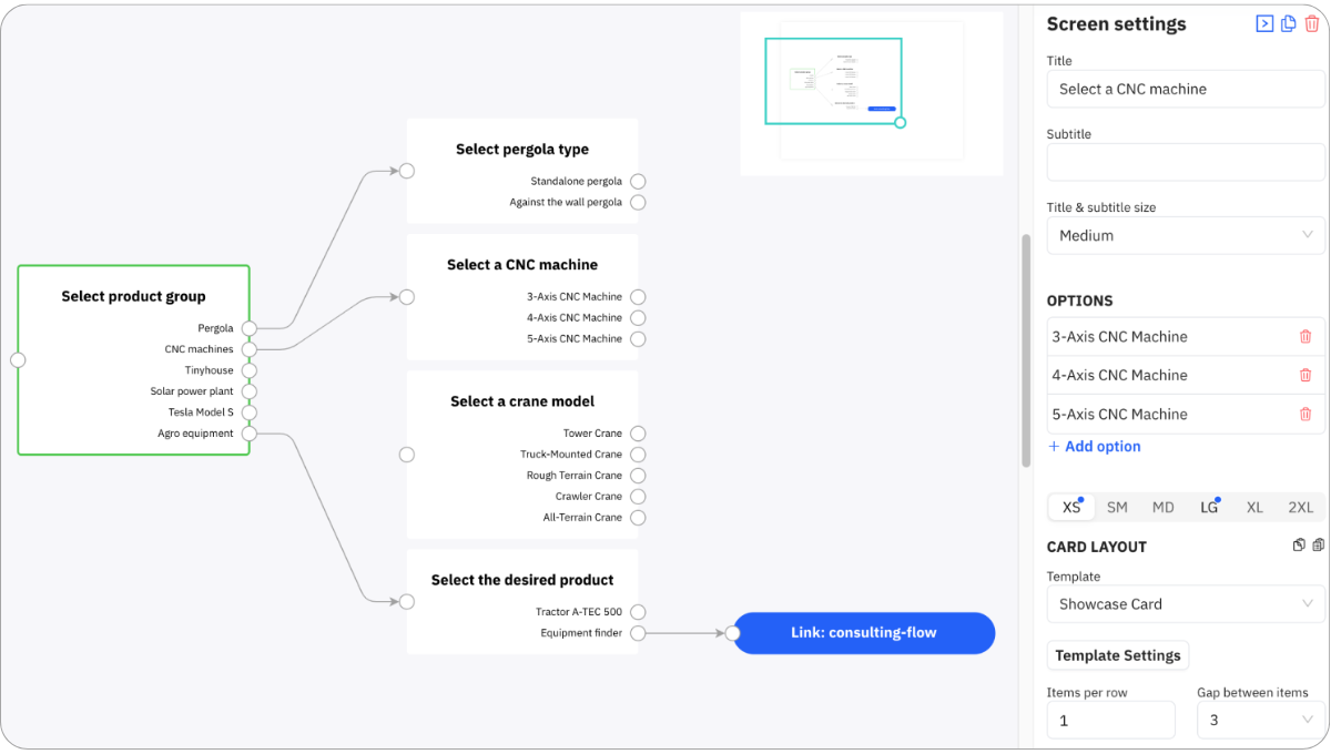
07 Use guided selling to narrow down options
If your product has a large number of options and categories, think about using Guided Selling to narrow down what your customers see.
In SaleSqueze, you can set up a Guided Selling flow that guides customers to the best product for them, based on categories or other relevant specifications you set up. Instead of browsing through all your products, the flow acts as a filter that saves your customers time and prevents them getting confused and frustrated.
Leverage well-designed configuration logic to improve your configurator’s user experience and increase your conversion rate. Don’t be afraid to talk to your customers and change things up if needed!