
Mobile configurators are transforming how businesses engage with customers on smartphones, especially as mobile commerce now dominates over 60% of U.S. e-commerce traffic. These tools allow users to customize products or services with touch-friendly interfaces, real-time feedback, and dynamic previews, directly leading to higher conversions and fewer product returns. For example, companies like Spa Solutions and Nordin have reported significant boosts in conversion rates and sales using mobile-friendly 3D configurators.
Key Takeaways:
- Mobile-first design: Prioritize smaller screens with clean layouts and touch-friendly interactions.
- Simplify navigation: Use step-by-step flows, progress indicators, and intuitive menus to prevent user frustration.
- Optimize for speed: Ensure fast load times and real-time updates to avoid losing users.
- Real-time feedback: Show immediate visual and pricing updates to build user confidence.
- Customization balance: Gradually introduce options to avoid overwhelming users.
Platforms like SaleSqueze demonstrate how businesses can leverage 2D, 3D, and 360° visualizations, automated quotes, and streamlined workflows to improve customer engagement and sales outcomes. Mobile configurators are no longer optional – they are essential for businesses aiming to thrive in today’s mobile-first commerce environment.
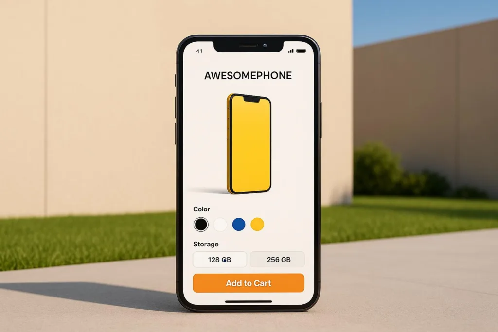
Core Design Principles for Mobile Configurators
Designing a mobile configurator that works seamlessly on smaller screens with touch-based interactions requires a thoughtful approach. By sticking to a few key principles, you can create an intuitive and enjoyable experience for users while addressing the specific challenges of mobile devices.
Start with Mobile-First Design
Designing with a mobile-first mindset means prioritizing smaller screens from the start and then expanding the design for larger devices. This approach is crucial since over 60% of e-commerce traffic now comes from mobile users. By focusing on mobile constraints first, you naturally eliminate unnecessary clutter, keeping the experience clean and efficient.
A critical component of mobile-first design is touch-friendly interactions. Interactive elements must be large enough to tap easily, with enough spacing to avoid accidental selections.
A great example of this principle in action is SaleSqueze. In 2022, they developed mobile-friendly configurators for manufacturers and dealers of outdoor living products. Their platform supports 2D, 3D, and 360° visualizations, optimized for touch interactions and real-time feedback. Whether configuring pergolas, glass roofs, or outdoor kitchens, users benefit from a streamlined navigation system designed with mobile in mind.
By starting with the limitations of a 5-inch touch screen, you create interfaces that are not only simpler and more focused but also translate well to larger devices. This approach ensures a consistent and effective user experience across all platforms.
Keep It Simple with Clear Navigation
Navigation is the backbone of any mobile configurator. Users should always know where they are in the process and what steps to take next, without feeling lost or overwhelmed.
Intuitive navigation patterns work best for mobile. Tabs, accordions, or step-by-step flows are far more effective than complex dropdown menus or deeply nested categories. Incorporating a “previous/next” stepper can further simplify the process, breaking it into manageable sections.
To prevent users from feeling overloaded, progressive disclosure is key. This technique reveals advanced features only when needed, keeping the interface uncluttered while still offering robust customization options.
Visual hierarchy also plays a huge role. Group related options together, use clear headings, and include progress indicators to show users their current step and how far they have to go. This not only keeps users engaged but also encourages them to complete the process. When navigation is unclear or overly complicated, users are more likely to abandon the configurator altogether.
Focus on Speed and Performance
Speed is everything when it comes to mobile configurators. Research shows that 53% of mobile users will leave if a site takes more than three seconds to load. Optimizing performance, therefore, directly impacts your conversion rates.
To ensure fast load times, focus on optimizing assets like images and 3D models. Compress files to maintain quality without slowing down performance. Efficient caching and streamlined code are also essential for smooth interactions, especially on slower mobile networks.
Responsive layouts are another must-have. Your configurator should adapt instantly to different screen sizes and orientations. Users often rotate their devices while interacting with a configurator, and the interface should adjust seamlessly to maintain a smooth experience.
Beyond loading speed, performance extends to real-time updates. Users expect immediate feedback when they make selections, whether it’s a price change, availability update, or visual preview. Any lag in responsiveness can disrupt the flow and erode trust. A fast, responsive configurator not only enhances user confidence but can also boost conversion rates by up to 30%.
Improving User Experience in Mobile Configurators
When it comes to mobile configurators, a smooth and intuitive user experience is essential. By focusing on real-time feedback and easy-to-use navigation, you can ensure users feel confident and engaged throughout their journey. Let’s explore how these elements come together to create a seamless experience.
Provide Real-Time Feedback and Confirmation
Real-time feedback is the backbone of any effective mobile configurator. When users make a choice – whether it’s selecting a color, material, or feature – they should see their selection instantly reflected in the product preview. This immediate response not only keeps users engaged but also reassures them that their input has been registered.
Pairing visual updates with confirmation messages takes this a step further. For instance, if a user selects a new color for an outdoor structure, the 3D model should update right away while a brief message, like “Color updated,” appears. This dual feedback system builds trust and keeps users invested in the process.
Another key feature is automated quote generation, which updates pricing in real time as users make changes. This level of transparency helps eliminate guesswork, making it easier for users to make informed decisions. In fact, this approach has been shown to reduce abandonment rates and increase conversion rates by as much as 30%.
Progress indicators, such as a simple progress bar or step counter, are also invaluable. They let users see how far they’ve come and what steps remain, helping to maintain momentum and reduce the likelihood of users giving up midway through the configuration process.
While real-time feedback keeps users engaged, an intuitive navigation system ensures they can easily move through the configurator without frustration.
Simplify and Enhance Navigation
A well-designed navigation system is crucial for creating an enjoyable and accessible experience. Start with high-contrast visuals and appropriately sized text to ensure readability in various lighting conditions and for users with different abilities. Touch targets should be large enough to tap easily, with enough spacing to prevent accidental selections.
Clear and logical navigation paths are essential. Users should always know how to move forward, go back, or explore other options without confusion. Features like tabbed interfaces and accordion menus are particularly effective on mobile devices, as they organize choices without cluttering the screen.
To make your configurator even more inclusive, ensure compatibility with screen readers and keyboard navigation. These features not only expand accessibility for users with disabilities but also improve clarity for everyone by providing clear labels and logical tab orders.
For users who might need extra guidance, context-sensitive help is a great addition. Tooltips or expandable sections can offer explanations for complex features or technical details without overwhelming the interface. This way, users can access information when they need it, rather than being bombarded with it upfront.
Breadcrumb navigation or a step-by-step flow can further enhance the user experience by showing users exactly where they are in the process and what actions they can take next. By reducing cognitive load and keeping navigation intuitive, users are more likely to complete their configuration and proceed to checkout with confidence.
Balance Customization with Simplicity
Striking the right balance between offering rich customization and maintaining simplicity is key to creating a successful mobile configurator. Users want the freedom to personalize while navigating an easy-to-use interface. Achieving this requires thoughtful design that presents options strategically and allows experimentation without overwhelming the user.
Avoid Overwhelming Users with Too Many Options
A well-designed configurator should guide users through choices without bombarding them with options all at once. One effective method is progressive disclosure, which unveils customization choices gradually. Instead of displaying every possible option upfront, start with the basics and introduce more detailed choices as the user advances through the process.
For example, an outdoor living product configurator might begin with simple decisions, such as selecting the structure type and size. As users progress, they can explore additional options like materials, colors, and advanced features, such as motorized components or lighting systems. This step-by-step approach, as seen in platforms like SaleSqueze, keeps the process manageable and prevents cognitive overload, which can often lead to users abandoning their configurations.
To further simplify, incorporate tooltips and expandable sections that provide on-demand explanations for technical terms like “powder coating” or “wind load ratings.” A quick tap reveals helpful details without interrupting the flow, making the experience accessible to both beginners and experienced users.
Visual feedback is another game-changer. Real-time 3D updates allow users to see how their choices impact the final product. As SaleSqueze puts it:
“Show your product in 3D and give your customers that ‘wow’ moment so they feel confident and ready to buy.”
This immediate visual confirmation makes the customization process feel engaging and tangible, reducing the abstract nature of decision-making and enhancing user satisfaction.
Offer Reset and Undo Options
To encourage experimentation, it’s crucial to include reset and undo features that are easy to access and use. Knowing they can backtrack or start over empowers users to explore bold configurations without the fear of making irreversible mistakes.
Simple tools like an “Undo Last Change” button or a “Reset All” option provide a safety net, giving users the confidence to try different combinations. These features can also lead to higher-value configurations, as users feel more comfortable branching out from default options.
For an even better experience, consider smart reset options. These allow users to reset specific aspects of their configuration, such as “Reset Colors Only” or “Reset to Basic Configuration”, while preserving other selections. This approach respects the effort users have already invested while still offering flexibility.
Prioritize Performance and User Feedback
No matter how well-designed a configurator is, it must perform seamlessly. Users expect instant responses to their inputs, especially when working with complex 3D visualizations on mobile devices. Slow load times or lag can quickly turn a polished experience into a frustrating one.
Regular testing and iteration are essential to maintaining this balance. Analyzing user behavior – such as where they hesitate, backtrack, or abandon the process – can provide valuable insights for refining the configurator. By continuously improving option presentation and navigation, you ensure the experience remains both comprehensive and easy to use over time.
sbb-itb-ec816af
Use Technology for Better Configurator Features
Modern platforms now offer advanced tools that were once exclusive to custom-built systems, transforming configurators into powerful assets for boosting conversions and simplifying sales processes.
Add 2D, 3D, and 360° Visualizations
Dynamic visuals are a cornerstone of effective mobile configurators. When customers can see their customizations unfold in real time, it creates an engaging experience that builds trust and encourages purchasing decisions. Real-time 3D rendering allows users to rotate, zoom, and examine products from every angle as they make their selections. For outdoor living products like pergolas, awnings, or outdoor kitchens, this means customers can instantly explore different materials, colors, and layouts, eliminating much of the guesswork.
Optimizing performance is essential for mobile users. Advanced configurators need to load quickly and operate smoothly across various devices and network conditions. This involves compressing visual assets and using adaptive rendering to adjust quality based on the device’s capabilities. Platforms like SaleSqueze tackle these challenges with cloud-based processing and optimized graphics delivery. Features such as 360° views and interactive animations keep users engaged without making the interface feel overwhelming.
These visualization tools not only captivate users but also drive higher conversion rates, paving the way for even more streamlined sales processes.
Automate Quotes and Streamline Sales
Beyond visual enhancements, automating pricing can significantly accelerate the sales cycle. Automated quote generation simplifies complex calculations, delivering instant pricing updates that help customers make faster, more informed decisions as they customize their products.
The benefits of automated quoting are clear. Some businesses have reported creating 40 branded quotes worth €10 million in just one month. Others have seen up to a 5x increase in qualified leads and a 40% rise in sales within three months. These systems also ensure professional quote delivery by generating branded PDFs that are sent to customers instantly, minimizing delays and keeping the momentum going. Integration with ERP and CRM systems further enhances efficiency by automatically updating inventory, customer records, and order workflows. Plus, 24/7 self-service options enable customers to configure and price products anytime, expanding lead opportunities and improving overall customer experience.
Key Takeaways for Mobile Configurator Design
To create effective mobile configurators, businesses must prioritize a mobile-first approach that emphasizes simplicity, speed, and intuitive navigation. Real-time visual feedback is also essential. With mobile commerce making up 72.9% of total e-commerce sales in the US in 2021, mobile configurators can no longer be an afterthought.
Performance matters. Slow configurators can drive users away, while features like real-time visuals and dynamic pricing can reduce cart abandonment by as much as 35%. A great example is Volkswagen, whose mobile product configurator achieved a 28% increase in completed configurations and a 15% boost in conversion rates by focusing on user-friendly navigation, real-time updates, and responsive pricing.
Striking the right balance between customization and simplicity is crucial. Take Hager’s engineering configurator, for instance. By using tile-based navigation and instant feedback, they cut configuration errors by 40% and increased order volumes by 22%. Features like progressive disclosure and reset/undo options help keep the user experience clear and manageable.
Advanced visualization technologies elevate configurators from basic selection tools to immersive sales platforms. In fact, configurator-driven sales have conversion rates up to 30% higher than standard product pages. This makes investing in tools like 2D, 3D, and 360° visualizations a smart move for businesses looking to boost engagement and streamline their sales processes.
For outdoor living businesses, tools like SaleSqueze offer pre-built 3D configurators that can be launched in just one day. These configurators provide full control over branding, pricing, and product details without requiring lengthy development time. Companies using this platform report 70% faster quote generation, 5x more qualified leads, and 40% sales growth within three months.
To succeed, businesses must treat mobile configurators as fully integrated sales tools. Seamless backend integration, automated quoting, and 24/7 self-service capabilities ensure scalable solutions that meet the demands of today’s mobile-first commerce landscape.
FAQs
Why is a mobile-first design crucial for product configurators on smartphones?
Designing with a mobile-first mindset means creating product configurators that work seamlessly on smaller screens and touch interfaces, making them easier and more intuitive to use. This approach emphasizes smooth navigation and clear visuals, which are key to keeping mobile users engaged.
By prioritizing mobile-first principles, businesses can include features like real-time product visualization and instant pricing. These tools help customers make faster, more informed decisions, cutting down on errors and minimizing the need for back-and-forth communication. The result? A more efficient sales process, higher conversion rates, and happier customers.
How does real-time feedback in mobile configurators improve user engagement?
Real-time feedback in mobile configurators boosts user engagement by instantly reflecting changes as users personalize products. This on-the-spot visualization allows users to see their options clearly, reducing uncertainty and making them feel more confident in their decisions.
It also helps prevent mistakes during quoting and ordering, simplifying the process for both customers and businesses. Quicker and more precise interactions create a seamless experience, ultimately driving higher conversion rates.
Why is it crucial to balance customization and simplicity in mobile configurator design?
Balancing customization with simplicity in mobile configurator design plays a critical role in delivering a smooth user experience. Offering too many choices can overwhelm users, while providing too few may leave their needs unmet. Finding the right middle ground ensures the configurator remains easy to use, engaging, and effective in helping users make decisions.
An effective configurator focuses on clarity, eliminates unnecessary steps, and emphasizes key features. This approach not only improves usability but also encourages conversions by keeping users confident and focused as they tailor products to their preferences. For businesses, this balance translates to quicker sales cycles and happier customers.